Site menu:

cNORM - Examples
Content
- Modeling a Vocabulary Test for Ages 2 to 17 Years
- Biometrics: Modeling BMI for Ages 2 to 25 Years
- Modeling Reaction Times and Processing Times
- Concluding Remarks
In the following, we would like to present three additional examples of using cNORM. These examples will showcase its versatility in different contexts.
By working through these examples, you'll gain a deeper understanding of how to use cNORM effectively in your own projects. You can replicate the first two examples using the data already included
in the package. To begin, please install cNORM and activate the cNORM library.
1. Modeling a Vocabulary Test for Ages 2 to 17 Years
The dataset employed in the following example (dataset 'ppvt') has already been used in the section Parametric Modeling. This dataset is an unselected sample from a German vocabulary test. Unlike the 'elfe' dataset, this dataset contains a continuous age variable, which will be used this time as the explanatory variable instead of a discrete grouping variable. For determining the percentiles, we will use a 'sliding window' approach.
# Determining manifest percentiles and norm scores with 'sliding window'
# The size of the window is 1 yearmodel.ppvt <- cnorm(raw=ppvt$raw, age=ppvt$age, width=1)
The returned model explains 99.23% of the data variance, which is quite good. When neither Radj2 nor the number of terms is specified, the cnorm() function returns the model with the highest Radj2 without major inconsistencies. As a result, the returned model has a very high number of 19 predictors. Therefore, we should search for a more parsimonious model. To do this, we'll first examine how the inclusion of predictors affects Radj2.
# Plots Radj2 as a function of the number of predictors
plot(model.ppvt, "subset", type=0)
The plot shows that Radj2 doesn't change significantly beyond 6 predictors. To further assess the different model fits, we'll generate a series of percentile plots with 3 to 15 predictors.
# Generates a series of percentile plots with increasing number of predictors
plotPercentileSeries(model.ppvt, start = 3, end = 15)
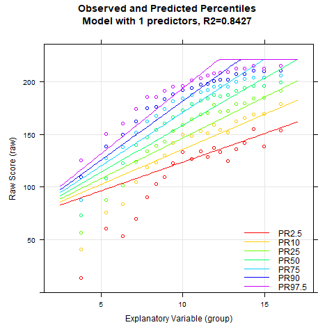
While the percentile plot looks smooth even with only 5 predictors, closer inspection of this model reveals that the percentile lines bend upwards in the high performance range at higher age levels. This effect likely doesn't reflect reality. Instead, one would expect all percentile lines to become increasingly flat in the higher age ranges. This undesirable effect slowly disappears when further predictors are added. It is barely visible in the model with 9 predictors and disappears completely from 12 predictors onwards. We therefore calculate a cross-validation as a control. Due to the 'sliding window', this will take some time. Therefore, the number of repetitions is set to "only" 10.
cnorm.cv(model.ppvt$data, repetitions = 10, min = 3, max = 12)
When we look at the cross-validation results, we find that the models with 9 or 12 predictors don't really outperform or underperform compared to the simpler 7-predictor model. However, from a visual standpoint, the 12-predictor model seems to have the edge. Given this, let's take a closer look at the consistency of these different models. The best tool for this job is the 'plot("derivative")' function, which we'll put to use here. This function gives us the first partial derivative of the regression function with respect to person location. In our case, we expect higher norm scores to correspond with higher raw scores on the test. This means the partial derivative should always be positive, or at worst, zero if we're dealing with floor or ceiling effects. This check is crucial because it helps us ensure that our model behaves as expected across the entire range of scores, maintaining the logical relationship between raw scores and norm scores.
Since we want to compare the three models with 7, 9, or 12 predictors in the following, we must first determine each model and subsequently apply the 'plot("derivative")' function to it.
# Checks the limits of the model validity by means of the partial
# derivative of the raw scores with respect to person location within the
# specified age range. The derivative should not have a zero crossing.
model.ppvt7 <- cnorm(raw=ppvt$raw, age=ppvt$age, width=1, terms = 7)
plot(model.ppvt7, "derivative", minAge=2, maxAge=20, minNorm=20, maxNorm=80)
model.ppvt9 <- cnorm(raw=ppvt$raw, age=ppvt$age, width=1, terms = 9)
plot(model.ppvt9, "derivative", minAge=2, maxAge=20, minNorm=20, maxNorm=80)
model.ppvt12 <- cnorm(raw=ppvt$raw, age=ppvt$age, width=1, terms = 12)
plot(model.ppvt12, "derivative", minAge=2, maxAge=20, minNorm=20, maxNorm=80)
The result is as follows:
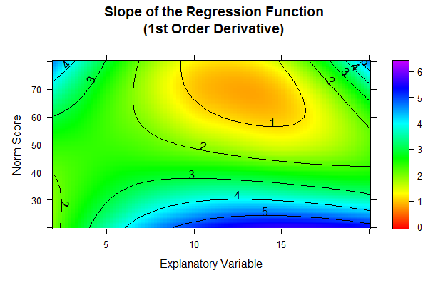
The colors in the diagramms are individually adjusted to the available range of values. Since this range is largest for the model with 12 predictors, the colors of the three figures cannot be compared to each other one-to-one. However, in the models with 7 and 9 predictors, a black dashed line is visible at the upper edge of the diagramm. This line marks the zero crossing and therefore reveals model inconsistencies for ages between about 12 and 15 in the very high performance range (near T = 80). The 12-predictor model doesn't exhibit such a zero crossing, i.e., while it doesn't necessarily fit the data better, it's more consistent than the other two models and should therefore be our pick.
That said, we need to consider whether it's really necessary or even meaningful to tabulate the test up to a T-score of 80, especially given that the test clearly shows at least a slight ceiling effect at this point. Even with a fairly large sample size of N = 4542, as we have here, the norming error is typically quite high for performance levels three standard deviations away from the population mean. To put this in perspective, statistically speaking, we'd expect only about 6 children in the entire sample (across all age groups) to actually score a T-score of 80 or higher. This means that T-scores of 80 or above (and similarly, 20 or below) aren't really well-anchored empirically. In essence, we're pushing the limits of what our data can reliably tell us when we extend to these extreme scores. It's a reminder that while our statistical tools are powerful, they're not magic - we need to be mindful of the practical limitations of our data and what we can reasonably infer from it.
A similar question arises when deciding up to which age norm scores should be reported. In fact, the dataset contains no individuals who are 17 or older. Nevertheless, the regression function could theoretically be extended to age ranges not present in the normative sample. In the derivative plots, we displayed a range up to age 20. Model inconsistencies in the form of zero crossings of the derivative are not detectable even in this high age range when the model with 12 predictors is selected. Nevertheless, we caution against such extrapolations. Test norms should always be based on empirical data. Especially extrapolations into age ranges not represented in the normative sample carry a high error risk, both in distribution-free and parametric norming.
Comparison between distribution-free and parametric norming
In the chapter on parametric norming, we had already demonstrated that norms for the ppvt dataset can also be generated using a beta-binomial distribution. Therefore, we want to directly compare the results of the distribution-free modeling with those of the parametric modeling. We will do this graphically. For this purpose, we have superimposed the percentile plots of both models. Unfortunately, there is currently no function available in the cNORM package to do this. The following percentile plot was thus created using other software.

Let's take a closer look at the percentile plot. Here, the points represent our raw data, while the solid and dashed lines show the distribution-free and parametric models, respectively. For most of the age range in our normative sample (from 2 years 6 months to 16 years 11 months), both models track each other closely across a broad spectrum of performance. It's only when we get down to the far below-average range (the 2.5th percentile) that we start to see some notable differences. But here's the thing: even our raw data gets pretty unreliable in this low-performance zone. You can see this in the way the red points zigzag erratically with age, instead of following a smooth curve. This suggests that measurement uncertainty is generally high in this range, which naturally leads to uncertainties in our modeling.
The distribution-free model seems to stick a bit closer to our raw data in this tricky area. In contrast, the parametric model's 2.5th percentile line appears to run a tad high on average. Now, the million-dollar question is: which model better reflects the actual population distribution? The answer hinges on how well our normative sample represents the broader population. Unfortunately, that's not something we can definitively determine in this case. This scenario underscores a crucial point in statistical modeling: our models are only as good as the data we feed them. When we're dealing with extreme scores or underrepresented groups, we need to be especially cautious in our interpretations and aware of the limitations of our data.
Generation of norm tables
Let's wrap up by creating norm tables and saving them as Excel files. First, we need to decide on an appropriate range for the norm scores. Remember, we noted earlier that the 2.5th percentile line comes with quite a bit of measurement and norming uncertainty. Given this, it doesn't make much sense to include even more extreme scores. So, we'll stick to the range between the 2.5th and 97.5th percentiles, which roughly maps to T-scores between 30 and 70.
Now, what about the table format? With the PPVT having 228 items, it'd be overkill to list a norm score for every possible raw score. A smarter approach is to show the raw score range for each whole-number T-score. That's where the 'normTable()' function comes in handy. Keep in mind that these whole-number T-scores actually represent intervals. For instance, a T-score of 50 covers the range from 49.5 to 50.5. We'll need to include all the integer raw scores that fall within each T-score interval. To achieve this, we'll use the interval boundaries rather than midpoints when setting up the table. This way, we can easily identify which integer raw scores belong to each T-score interval. For the extreme ends of the range, we can use '≤' and '≥' in the test manual to denote the lower and upper boundaries.
Age gradation is another factor to consider. While continuous norming allows for incredible precision, there's no point in having two separate age tables if they're identical. The trick is to choose age intervals that are wide enough to show small but noticeable changes in how raw scores map to norm scores. In this example, we choose quarterly intervals for 11-year-old children. The age levels specified in the function correspond to the respective interval midpoints.
We also want to save the tables on the computer so that we can edit them later (e.g., in Excel). For this purpose, the 'openxlsx' package can be used, which you may need to install first:
# Installs the openslxs Package and
# loads the according libraryinstall.packages("openxlsx", dependencies = TRUE)
library(openxlsx)
# Generates the specified norm tables and
# writes them to the specified pathwrite.xlsx(normTable(c(11.125,11.375, 11.625, 11.875), model.ppvt12, minNorm=30.5, maxNorm=69.5, step = 1), file = "C:/Users/Documents/cnorm/normTables_ppvt_11.xlsx")
Please note that in the norm tables we've just saved, only the norm and raw scores at the interval boundaries are output. To create tables where each integer norm score corresponds to an integer raw score range, you'll need to round these values up or down as appropriate. But don't worry - that's a task we're confident you can handle without our help. It's just a bit of straightforward data processing.
2. Biometrics: Modeling BMI for Ages 2 to 25 Years
cNORM can be used to model not just psychological traits, but also biometric data. We'll demonstrate this using a dataset from the Center for Disease Control (CDC, 2012), which is included in the cNORM package and contains raw data on Body Mass Index (BMI) development. You can find a description of this dataset in the help files of the cNORM package.
BMI is a continuous variable, so it can't be modeled using the beta-binomial distribution. Moreover, BMI development actually differs between males and females, which would typically require modeling two separate curves. For simplicity's sake, though, we'll demonstrate the modeling process using the entire dataset.
If you'd like to see how the results would look separately for males and females, feel free to try it out as an exercise. By the way, you can use the following code to create two separate datasets split by gender:
# Creates two separate datasets for boys and girls
CDC_male <- CDC[CDC$sex==1,]
CDC_female <- CDC[CDC$sex==2,]
For now, we'll continue with the original dataset. Since it's quite large, we'll use the discrete grouping variable already present in the dataset to rank the data, which helps reduce computational load. All subsequent modeling steps will be performed on the continuous age variable.
# Determining a model for the BMI variable
model.bmi <- cnorm(raw=CDC$bmi, group=CDC$group)
Once again, the 'cnorm()' function, without specifying the number of terms, returns the model that explains the maximum amount of data variance without showing significant inconsistencies. The Radj2 is 99.33%, but this comes at the cost of a whopping 23 predictors. Let's see if we can find a more parsimonious model. First, let's take a look at how the explained variance is affected by the number of predictors:
# Plots Radj2 as a function of the number of predictors
plot(model.bmi, "subset", type=0)

It looks like Radj2 doesn't increase substantially beyond 8 predictors. To get a visual impression, let's create a series of percentile plots ranging from 5 to 15 predictors.
# Creates a series of percentile plots with an increasing number of predictors
plotPercentileSeries(model.bmi, start = 5, end = 15)
The percentile series shows that the model remains largely stable from about 10 predictors onwards. At this point, the explained variance is already 99.3%.
Notably, the BMI data exhibit a relatively complex age progression. In the lower percentile lines, BMI initially decreases from about age 2 to 7. During this phase, the human body transforms from the compact form of a baby to a more elongated shape. Afterwards, BMI increases continuously until about age 23. The model with 10 predictors seems to fit the data quite well within this range. However, our model indicates that BMI slightly decreases at even higher ages. This effect is neither particularly plausible nor does it fit the data well. The manifest data suggest that BMI continues to increase or at most remains constant from this age onward.
For such complex age progressions, it can help to increase the parameter 't' for age adjustment. The maximum is 6. However, with such a high value and the large sample size of N = 45,035, the computer would take an extremely long time to calculate. Setting 't' to 6 will probably rarely be necessary. So, let's try t = 5.
model.bmi <- cnorm(raw=CDC$bmi, group=CDC$group, t=5)
Due to the large dataset and the high number of powers, we'll need to wait a while for the result.
...
Finally: The result is in. It looks much better: Radj2 = 99.67%, but now 35 terms are returned. That's definitely too many. So, let's output Radj2 and
the percentile plots as a function of the number of predictors to search for a more parsimonious model.
plot(model.bmi, "subset", type=0)
plotPercentileSeries(model.bmi, start = 5, end = 20)
Beyond 15 predictors, the increase in explained variance becomes negligible. Therefore, we're looking for a model with at most 15 predictors that still provides reasonable percentile lines in the higher age ranges. We zero in on a model with 14 predictors, which already explains 99.6% of the variance.

The model looks fantastic. It mirrors the manifest data almost perfectly, even in the higher age ranges. To finalize our model selection, let's recalculate the model, locking in 14 terms.
model.bmi <- cnorm(raw=CDC$bmi, group=CDC$group, t=5, terms=14)
It's worth noting that with such a large dataset, an alternative approach could have been to form two age groups and model them separately, rather than increasing t. For example, we could have modeled ages 2 to 12 and 12 to 25 independently. An even more effective method would be to allow these age ranges to overlap slightly, perhaps using groups from 2 to 15 and 12 to 25. You might want to try this approach yourself. To create such groupings, you can use the following code:
# Generates two distinct age groups
CDC_young <- CDC[CDC$age<=15,]
CDC_old <- CDC[CDC$age>=12,]
3. Modeling Reaction Times and Processing Times
Reaction (or processing) times typically have an extremely right-skewed distribution. This is because reaction times are bounded at 0 on the lower end, but have little to no upper limit. Often, reaction times undergo a logarithmic transformation before further analysis to approximate a normal distribution. Unfortunately, such a logarithmic transformation is difficult to achieve with Taylor polynomials. For reaction times, it can therefore be advantageous to subject the data to a logarithmic transformation prior to modeling. If the transformation serves its purpose and approximates the distributions to normal distributions, the data can subsequently be better approximated with Taylor polynomials.
We would like to demonstrate such a case here using a flanker task from an ADHD test battery for children from 6 to 12 years of age. In this task, the children have to respond as quickly as possible to a left-pointing arrow with a left key press and to a right-pointing arrow with a right key press. They have to ignore arrows that appeared around the target arrow. The task measures attention processes. Each child completed 100 trials, which were subsequently averaged. Due to copyright reasons, we unfortunately cannot make the dataset available in cNORM.
The data cannot be modeled with the beta-binomial distribution as they are continuous raw values. We therefore apply the distribution-free norming approach, initially to the untransformed reaction times. Since lower values in reaction times indicate better attention performance, we select 'descend=TRUE' in the 'cnorm()' function this time. This results in low raw values being associated with high percentiles.
# Determines a model for the variable 'raw2' from the 'ADHD' dataset
model.ADHD <- cnorm(raw=ADHD$raw2, age=ADHD$age, width=1, descend=TRUE)

Unfortunately, we only achieve an Radj2 of 97.9%. Moreover, the PR2.5 line appears to be too straight, while the PR97.5 line is too wavy. We therefore subject the raw values to a logarithmic transformation and then model again. We also examine Radj2 as a function of the number of predictors and subsequently generate a percentile series.
# Logarithmische Transformation der Rohwertvariable
# und NeumodellierungADHD$lograw2 <- log(ADHD$raw2)
model.ADHDlog <- cnorm(raw=ADHD$lograw2, age=ADHD$age, width=1, descend=TRUE)
plot(model.ADHDlog, "subset", type = 0)
plotPercentileSeries(model.ADHDlog, start = 2, end = 10)

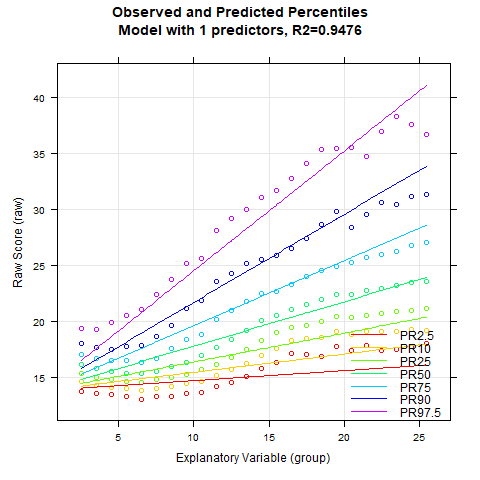
Radj2 still does not exceed the 99% threshold, but we're now considerably closer. It also appears that no substantial model improvement is achieved beyond 6 predictors. We therefore examine the model with 6 predictors.

This 6-predictor model is looking promising. It accounts for 98.6% of the data variance. Now, typically, anything under 99% might raise eyebrows, suggesting the data isn't playing nice with our modeling efforts. But in this case, it's not our method that's at fault. Reaction times and processing speeds are notoriously fickle when it comes to reliability, and that's showing up in our norming process, too. We have no choice but to be satisfied with this result. To finalize the model selection, we perform a recalculation, setting the number of terms to 6.
model.ADHDlog <- cnorm(raw=ADHD$lograw2, age=ADHD$age, width=1, descend=TRUE, terms=6)
Here's a crucial point to remember: when you've put your data through a logarithmic transformation before norming, you can't forget about that when you're creating your norm tables. You'll need to apply the exponential function to the raw values in your table to get the final mapping between average reaction times and norm scores. Skip this step, and you'll end up with some very confused interpretations!
Concluding Remarks
Modeling large datasets is often akin to sculpting. You chip away a bit here, add a touch there, all in pursuit of a visually satisfying result. In many cases, there's no clear-cut right or wrong approach. It's important to remember, though, that even the most sophisticated modeling can't salvage a test based on a highly unrepresentative or too small dataset, or one with significant measurement error. Unfortunately, the biggest norming errors typically crop up at the extremes of the value range, particularly at the lower end. This isn't unique to cNORM; it's a challenge for all norming procedures.
The irony is that these extreme areas often carry the most weight in diagnostic practice. A low norm score can be the deciding factor in a child's educational path, the allocation of support measures, or the need for therapeutic intervention. This underscores the immense responsibility that test developers shoulder.
The process of test norming demands not just expertise, but also meticulous care and diligence. Our hope is that cNORM can help ease this burden, making it easier to meet these demanding requirements and, ultimately, enhance diagnostic reliability. In essence, while we've provided powerful tools, the art of test construction still requires a deft touch and a keen eye. It's a delicate balance of science and craft, where the stakes are high and the impact on individuals' lives can be profound.
 |
Modelling with Beta-binomial Distributions |
Graphical User Interface |
 |