Site menu:

cNORM - Distribution-free Modeling
Content
- Calculation of Manifest Norms and Modeling
- Model Selection
- Cross Validation
- Generating Norm Tables
- Useful Tools
- Combining cNORM with IRT-based ability estimates
Calculation of Manifest Norms and Modeling
In the cNORM package, distribution-free modeling of norm scores is based on estimating raw scores as a power function of person location l and the explanatory variable a (see mathematical derivation). This approach requires several steps, which internally can be executed by a single function - the 'cnorm()' function.
First, the 'cnorm()' function estimates preliminary values for the person locations. To this purpose, the raw scores within each group are ranked. Alternatively, a sliding window can be used in conjunction with the continuous explanatory variable. In this case, the width of the sliding window (function parameter 'width') must be specified. Subsequently, the ranks are converted to norm scores using inverse normal transformation. The resulting norm scores serve as estimators for the person locations. To compensate for violations of representativeness, weights can be included in this process (see Weighting).
The second internal step is the calculation of powers for l and a. Powers are calculated up to a certain exponent 'k'. In order to use a different exponent for a than for l, you can also specify the parameter 't' (see mathematical derivation), which is beneficial in most cases. If neither k nor t is specified, the 'cNORM()' function uses the values k = 5 and t = 3, which have proven effective in practice. All powers are also multiplied crosswise with each other to capture the interactions of l and a in the subsequent regression. The object finally returned by the 'cnorm()' function contains the preprocessed data including the manifest norm scores and all powers and interactions of l and a in 'model$data'.
In the third internal step, 'cnorm' determines a regression function. Following the principle of parsimony, models that achieve the highest Radjusted2 with as few predictors as possible should be selected. The 'cnorm()' function uses the 'regsubset()' function from the 'leaps' package for regression. Two different model selection strategies are possible: You can either specify the minimum value required for Radjusted2. Then the regression function that meets this requirement with the fewest number of predictors is selected. Or you can specify a fixed number of predictors. Then the model that achieves the highest Radjusted2 with this number of predictors is selected. Unfortunately, it is usually not known in advance how many predictors are needed to optimally fit the data. How to find the best possible model is explained in the following section Model Selection. To begin with, however, we would first like to explain the basic functionality of cNORM using a simple modeling example. To do this, we will use the 'elfe' dataset provided and start with the default setting. Since cNORM version 3.3.0, this setting provides the model with the highest Radj2 while avoiding inconsistencies. (What we mean by 'inconsistency' is also explained in more detail in the section Model Selection).
The function returns the following results:# Models the 'raw' variable as a function of the discrete 'group' variable
model <- cnorm(raw = elfe$raw, group = elfe$group)
Final solution: 10 terms (highest consistent model)
R-Square Adj. = 0.992668
Final regression model: raw ~ L2 + A3 + L1A1 + L1A2 + L1A3 + L2A1 + L2A2 + L3A1 + L4A3 + L5A3
Regression function: raw ~ 9.364037344 + (-0.005926967039*L2) + (-0.3671738299*A3) + (-0.8979475089*L1A1) + (0.2831824479*L1A2) + (-0.002261103924*L1A3) + (0.0227853959*L2A1) + (-0.005173442779*L2A2) + (-6.018603629e-05*L3A1) + (6.496853126e-08*L4A3) + (-3.964545827e-10*L5A3)
Raw Score RMSE = 0.60987
Use 'printSubset(model)' to get detailed information on the different solutions, 'plotPercentiles(model) to display percentile plot, plotSubset(model)' to inspect model fit.
The model explains more than 99.2% of the data variance but requires a relatively high number of 10 predictors (plus intercept) to do so. The third line ('Final regression model') reports which powers and interactions were included in the regression. For example, L2 represents the second power of l, A3 represents the third power of a, and so on. By default, the location l is returned in T-scores (M = 50, SD = 10). However, IQ scores, z-scores, percentiles, or any vector containing mean and standard deviation (e.g., c(10, 3) for Wechsler scaled scores) can be selected instead by specifying the 'scale' parameter of the 'cnorm' function. Subsequently, the complete regression formula including coefficients is returned.
The returned 'model' object contains both the data (model$data) and the regression model (model$model). All information about the model selection can be accessed under 'model$model$subsets'. The variable selection process is listed step by step in 'outmat' and 'which'. There you can find R2, Radjusted2, Mallow's Cp, and BIC. The regression coefficients for the selected model ('model$model$coefficients') are available, as are the fitted values ('model$model$fitted.values') and all other information. A table with the corresponding information can be printed using the following code:
print(model)
Mathematically, the regression function represents a hypersurface in three-dimensional space. When R2 is sufficiently high (e.g., R2 > .99), this surface typically models the manifest data very well over wide ranges of the normative sample. However, a Taylor polynomial, as used here, usually has a finite radius of convergence. In practice, this means that at some age or performance ranges the regression function might no longer provide plausible values. The model might, for example, unexpectedly deviate strongly from the manifest data. Such areas are usually best recognized by graphically comparing manifest and modeled data. For this purpose, cNORM provides, among other things, percentile plots. They can be generated with the following code:
# Plots modeled and manifest percentiles
plot(model, "percentiles")
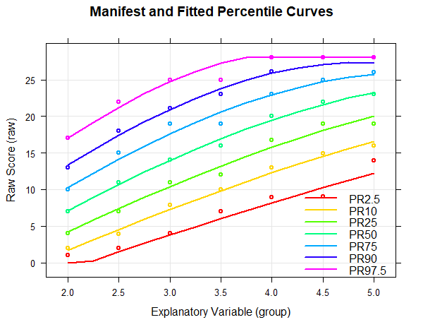
In the percentile plot, the manifest data are represented as dots, while the modeled percentiles are shown as lines. The raw score range is automatically determined based on the values from the original dataset. However, it can also be explicitly specified using the parameters 'minRaw' and 'maxRaw'.
As can be seen from the percentile plot above, the percentiles of the norming model run relatively smoothly across all levels of the explanatory variable and align well with the manifest data. Small fluctuations between individual groups are eliminated. The uppermost percentile line (PR = 97.5) runs horizontally from the fourth grade onwards. However, this does not represent a limitation of the model, but rather a ceiling effect of the test, as the maximum raw score of 28 is reached at this point. Nevertheless, implausible values or model inconsistencies often appear at those points where the test has floor or ceiling effects or where the normative sample is too sparse, that is, they usually occur at the boundaries of the age or performance range of the normative sample, or even beyond. Therefore, when checking the percentile lines, particular attention should be payed to the model's behavior at these boundaries.
Model Selection
Although the percentile plot suggests a good model fit, the number of predictors (i.e., 10) is relatively high. This high number carries the risk of potential overfitting of the data. The most obvious sign of overfitting is usually wavy (and therefore counterintuitive) percentile lines. Since they are not wavy for the calculated model, there is not much indication of relevant overfitting here. Moreover, if too much emphasis is placed on parsimony, insufficient fit in extreme performance ranges can occur. Therefore, the proposed model with 10 predictors seems to be an adequate option. However, the cNORM package provides methods to find even more parsimonious models, which we will demonstrate in the following.First, we recommend to perform a visual inspection using percentile plots. To this end, cNORM offers a function that generates a series of percentile plots with an increasing number of predictors.
# Generates a series of percentile plots with increasing number of predictors
plotPercentileSeries(model, start = 1, end = 15)

In this case, a series of percentile plots with 1 to 15 predictors was generated. As can be seen, the percentile lines begin to intersect from 12 predictors onwards in the higher grade levels. This means that a single raw score is mapped on two different norm scores, i.e., the mapping of latent person variables to raw scores is not bijective in these models. Consequently, at least for some raw scores, it would be impossible to determine a definitive norm score when using these models.
There can be various reasons for intersecting percentile lines:
- The test shows floor or ceiling effects. When the minimum or maximum raw score is reached for the first time, cNORM normally cuts off the norm scores automatically. Unfortunately, in unfavorable cases, intersecting percentile lines can still occur.
- Too many predictors were used. Please try to obtain a consistent model with fewer predictors.
- The power parameter 't' for the explanatory variable a was chosen too high. Usually, t = 3 will be sufficient to model the raw scores across age. If only three age groups exist, t should be set to a maximum of 2, and for only two age groups, to 1. Higher values are not reasonable in these cases.
- The regression model has been extended to age or performance ranges that were rare or non-existent in the normative sample. While it is mathematically possible to cover age and performance ranges that are not present in the normative sample, such extrapolation without empirical basis should be done with caution.
If the power parameter 't' for the explanatory variable a is chosen too high, very wavy percentile lines can occur in addition to crossing ones. For comparison, you will find below the series of percentile plots that is obtained with k = 5 and t = 4.

With 14 predictors, wavy percentile lines can be seen at PR = 2.5, but even with 7 or more predictors, the percentile lines no longer increase as monotonically as desired.
Let's return to our model series with k = 5 and t = 3, which evidently produces better results than k = 5 and t = 4. Our goal was to potentially find models that provide sufficiently good modeling results with fewer than 10 predictors. To this end, you can also examine how the addition of predictors affects Radjusted2. For this purpose, use the following command:
plot(model, "subset", type = 0)
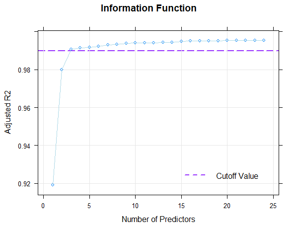
If 'type = 1' is set in the 'plot()' function instead of 'type = 0', Mallow's Cp is displayed in logarithmic form. With 'type = 2', the BIC (Bayesian Information Criterion) is plotted against Radjusted2.
Fortunately, the scale can be modeled very well, which is evident from the fact that it's possible to find consistent models that explain more than 99% of the data variance. This value is even achieved here with just three predictors (Radjusted2 = .991). With 8 predictors, 99.3% of the data variance is explained by the according model, only 0.2% more than with three predictors. But even such small increases can sometimes lead to significant improvements for extreme person locations. Beyond 8 predictors, however, a further addition of predictors does not even lead to changes in the per mille range. So all models between 3 and 8 predictors seem to fit well, but are more parsimonious than the model with 10 predictors and can thus be considered for selection, too. Which of these models should ultimately be selected will be determined through the following cross-validation.
Cross Validation
As described earlier, the goal of the modeling process is not necessarily to achieve maximum Radjusted2. A too-close fit of the model to the training data likely represents an overfitting to the (error-prone) sample. Instead, the models should predict the (usually unknown) distribution in the reference population as accurately as possible. To estimate how well this is achieved, cross-validation can be performed.
In this cross-validation implemented in the cNORM package, 80 percent of the data is repeatedly drawn as training data and validated against the remaining 20 percent. The training data is stratified by group, but randomly drawn within each group. As with the series of percentile plots, models with an increasing number of terms (i.e., predictors) are calculated during cross-validation. For each number of terms, the RMSE (based on raw scores or norm scores) and R2 (based on norm scores) are calculated for the training data, the validation data, and the complete dataset. Additionally, the 'crossfit' can be calculated as the ratio of R2 in training and validation.
The crossfit is typically higher than 1, as a model always fits training data better than new data. However, the higher it is, the more strongly this indicates overfitting of the data. Ideally, the crossfit should be as close to 1 as possible, as this indicates that the model fits the validation data at least similarly well as the training data. However, such a model should only be selected if, simultaneously, the RMSE of the norm scores in the validation data is as low as possible (or if R2 is as high as possible). Additionally, the standard error of the norm scores in the validation data should be as low as possible, as this indicates that the model has a stable fit.
In summary, a good model should demonstrate:
- A crossfit close to 1
- Low RMSE (or high R2) of the norm scores in validation data
- Low standard error of norm scores in validation data
These criteria collectively suggest a model that generalizes well to new data without overfitting, while maintaining high predictive accuracy and stability.
The following example performes a cross-validation based on the elfe data set with 30 repetitions and a number of 3 to 8 terms in the regression function:
model <- cnorm(raw = elfe$raw, group = elfe$group)
cnorm.cv(model$data, repetitions = 30, min = 3, max = 8)
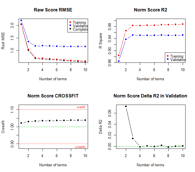
The results suggest that a model with 4 terms probably represents the best model. In this model, the RMSE of the norm scores is lowest in the validation data, while R2 is highest. Although the crossfit is not the lowest, it is closer to 1 than in the model with 3 predictors. Additionally, the standard error of the norm scores is lower than in the model with 3 predictors. The percentile plot also looks very good with 4 predictors. Therefore, the model with 4 predictors should be selected. To determine this model, a recalculation must be performed, but this time, the number of predictors has to be specified in the 'cnorm' function:
The following model is returned:# Determines the model with 4 predictors
model <- cnorm(raw = elfe$raw, group = elfe$group, terms = 4)
User specified solution: 4 terms
R-Square Adj. = 0.991412
Final regression model: raw ~ A3 + L1A2 + L2A1 + L2A2
Regression function: raw ~ -8.562056855 + (-0.08913080094*A3) + (0.05168132497*L1A2) + (0.003164634892*L2A1) + (-0.0009790480969*L2A2)
Raw Score RMSE = 0.66148
Although no crossing percentile lines are visible in the percentile plot of the model with 4 predictors, it's important to note that the lowest percentile line is only at PR 2.5 by default and the highest at PR 97.5. Theoretically, crossing percentile lines could occur in more extreme performance ranges. If norm scores are to be delivered that go beyond what is shown in the percentile plot, then the limits of model validity should be specified even more precisely. This can be done graphically, for example, by specifying a vector with percentiles to be plotted in the percentile plot.
# Plots the percentiles specified in the vector
plotPercentiles(model, percentiles = c(0.01, 0.05, 0.1, 0.9, .95, 0.99))
It is even easier to determine intersecting percentile lines with the 'checkConsistency' function. Please note, however, that the more extreme the norm scores, the more likely it is that inconsistencies will be found. We will therefore limit the examination to the T-score range of 25 to 75 for this test scale:
# Determines intersecting percentile lines
checkConsistency(model, minNorm = 25, maxNorm = 75)
Fortunately, the function reports that no inconsistencies were found within this range. The selected model is therefore consistent at least between T-scores of 25 and 75. If, after checking for consistency, a model proves to be suboptimal, it is advisable to alter the number of predictors or, if necessary, choose different values for k or t. Norm tables and norm scores should, of course, only be provided within the validity range of the regression model. Additionally, the range of norm scores should also be aligned with the size of the normative sample. For instance, in a sample of size N = 500, the probability of not having a single person with a T-score of 20 or lower is over 50%. Therefore, T-scores of 20 or lower (or 80 or higher) should not be tabulated for such sample sizes, as the regression models are associated with high uncertainty in these areas. This approach ensures that the reported norm scores are reliable and representative of the sample, avoiding extrapolation to extreme values where the model's predictions may be less accurate.
Generating Norm Tables
In addition to the pure modeling functions, cNORM also contains functions for generating norm tables or retrieving the normal score for a specific raw score and vice versa.
predictNorm
The 'predictNorm' function returns the normal score for a specific raw score (e.g., raw = 15) and a specific age (e.g., a = 4.7). The normal scores have to be limited to a minimum and maximum value in order to take into account the limits of model validity.
predictNorm(15, 4.7, model, minNorm = 25, maxNorm = 75)
predictRaw
The 'predictRaw' function returns the predicted raw score for a specific normal score (e.g., T = 55) and a specific age (e.g., a = 4.5).
predictRaw(55, 4.5, model, minRaw = 0, maxRaw = 28)
normTable
The 'normTable' function returns the corresponding raw scores for a specific age (e.g., a = 3) and a pre-specified series of normal scores. The parameter 'step' specifies the distance between two normal scores.
normTable(3, model, minRaw = 0, maxRaw = 28, minNorm=30.5, maxNorm=69.5, step = 1)
This function is particularly useful when scales have a large range of raw scores, and consequently, multiple raw scores correspond to a single (rounded) norm score. For example, for a tabulated norm score of T = 40, all integer raw scores that are assigned to norm scores between 39.5 and 40.5 would need to be listed. In the present case, the raw score 8.47 corresponds to T = 39.5, and the raw score 8.99 corresponds to T = 40.5. As a result, no single (integer) raw score would be assigned to a standard score of 40 in the test manual's table. Furthermore, the 'normTable()' funtion is also useful when norm scores for various subtests need to be tabulated in a single table.
rawTable
The function 'rawTable' is similar to 'normTable', but reverses the assignment: The normal scores are assigned to a pre-specified series of raw scores at a certain age. This requires an inversion of the regression function, which is determined numerically. Specify reliability and confidence coefficient to automatically calculate confidence intervals:
rawTable(3.5, model, minRaw = 0, maxRaw = 28, minNorm = 25, maxNorm = 75, step = 1, CI = .95, reliability = .89)
# generate several raw tables
table <- rawTable(c(2.5, 3.5, 4.5), model, minRaw = 0, maxRaw = 28)

You need these kind of tables if you want to determine the exact percentile or the exact normal score for all occurring raw scores.
Useful Tools
Plot of Raw Scores
In the following figures, the manifest and projected raw scores are compared separately for each (age) group. If the 'group' variable is set to 'FALSE', the values are plotted over the entire range of explanatory variable (i.e. without group differentiation).
plot(model, "raw", group = TRUE)

The fit is particularly good if all dots are as close as possible to the angle bisector. However, it must be noted that deviations in the extreme upper, but especially in the extreme lower range of the raw scores often occur because the manifest data in these ranges are associated with large measurement error.
Plot of Norm Scores
The function corresponds to the plot("raw") function, except that in this case, the manifest and projected norm scores are plotted against each other. Please specify the minimum and maximum norm score. In the specific example, T-scores from 25 to 75 are used, covering the range from -2.5 to +2.5 standard deviations around the average score of the reference population.
plot(model, "norm", group = TRUE, minNorm = 25, maxNorm = 75)

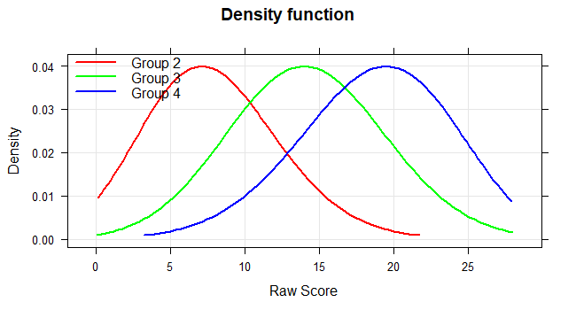
Probability Density Function
The 'plot("density") function plots the probability density function of the raw scores. This method can be used to visualize the deviation of the test results from the normal distribution.
plot(model, "density", group = c (2, 3, 4))
Curve Analysis of the Regression Function
Finally, we would like to remind mathematically experienced users that it is also possible to perform conventional curve sketching of the regression function. Since the regression equation is a polynomial of the nth degree, the required calculations are not very complicated. You can, for example, determine local extrema, inflection points etc..
In this context, the 'plot("derivative")' function provides a visual illustration of the first partial derivative of the regression function with respect to the person location. The illustration helps to determine the points at which the derivative crosses zero. At these points, the mapping is no longer bijective. The points therefore indicate the boundaries of the model's validity.
plot(model, "derivative")

Combining cNORM with IRT-based ability estimates
So far, all examples in this tutorial have modelled norms directly from raw scores. cNORM is, however, agnostic to the metric of the score variable - any quantitative person parameter can serve as input. A particularly attractive option is to combine continuous norming with Item Response Theory (IRT): instead of summing item responses, one estimates a latent ability θ for every person via an IRT model and then norms these θ values against age (or any other explanatory variable). This has the advantage that item-level information (difficulty, discrimination, missing responses) are taken into account by the measurement model and at the same time, an interpreteable metric for the Logits emerges in the form of the well known normed scores.
The following snippet illustrates the workflow with a simulated Rasch dataset. Person abilities are estimated using the TAM package via weighted likelihood estimation (WLE), and the resulting θ values are passed to
cnorm() together with the grouping variable.
library(TAM)
# 1. Simulate a Rasch dataset with 700 persons and 30 items
# only use item data
data <- simulateRasch(n = 700, items.n = 30)
data <- data$sim[, (ncol(data$sim) - 30):(ncol(data$sim) - 1)]
# 2. Fit a Rasch model and extract WLE person abilities
tam.model <- tam(data)
theta <- tam.wle(tam.model)$theta
# 3. Model continuous norms for the latent ability scores
cnorm.model <- cnorm(raw = theta, group = data$sim$group)
The call to cnorm() is identical to the one used for raw
scores - only the input variable changes. All subsequent functions
(predictNorm(), plot(),
getNormCurve(), .) work exactly as before, but now operate
on IRT-scaled ability estimates. This makes the Taylor polynomial
approach a flexible post-processing step for virtually any psychometric
scoring procedure, including 2PL, 3PL, partial credit or rating-scale
models, or adaptive testing.
Note: Logits can also be modeled parametrically if an appropriate distribution is chosen. However, this is not possible with beta-binomial distributions, as they can only handle discrete, integer, positive values within a fixed range, nor is it possible with the commonly used distributions of the Box-Cox family, as these require positive values greater than 0. An alternative would therefore be, for example, shash.
 |
Weighting |
Parametric Modeling |
 |